

I started working with React some years ago and it is still my go-to for almost every website that I build. My blog is developed with Gatsby (another fantastic framework based on React), but since I had my first experience with Next.js I realized that this tool would be part of my future projects. And because of this I created this modern starter for Next.js applications.
Why Next.js?
- Next.js provides a flexibility to render pages on the client or the server, or a mix of both.
- We can use this framework to create traditional SPA applications or websites that need to be indexed on search engines. So, it’s perfect for SEO.
- Next.js also generates static files, which is also perfect to create pages (or entire websites) that don't need to be dynamic.
- By using it, we don’t need to worry about performance because this framework handles most of the complexity for us: minifying javascript, code splitting, pre-fetching, caching and much more.
Why do I need to use a boilerplate?
Despite all the advantages of Next.js, boilerplates (or starters) help us to save time configuring the basic settings for our projects: support for PWA, typescript, storybook, tests, lint, ensuring consistent coding…
So, based on the needs of the projects I have worked on, I created a boilerplate that I use every time I start a new web application. And maybe it can also be useful for you too. 😁✨
Main configurations of my Next.js boilerplate
Javascript with Typescript
Typescript was created by Microsoft and has been increasing in popularity as you can see in this survey of 2020.
“The bigger the app you’re writing, the more useful typescript is.” - Anders Hejlsberg
It’s a superset of javascript that provides static typing to help us to save our project from failure by catching bugs, making our code more self-documented and more readable. Because typescript has cross-browser compatibility, it also provides the ability to use modern JS features for any browser (once the final code will be transpiled to vanilla javascript).
You can check out more benefits of TS by watching this video.
Consistent code using EditorConfig, Prettier, ESLint and typescript-eslint
Especially when we are working in a team, our code needs to be consistent. So, all these tools help us to avoid common pitfalls and improve our code syntaxes.
- EditorConfig: it helps us to configure and format our code through indentation style, indentation size, line width and more.
- Prettier: as we can read on its website, it’s an opinionated code formatter. It takes care of our code formatting when saving our file: enforce trailing semicolons and commas, use only single quotes, and other things.
- ESLint: totally customizable, and more than a code formatter, it helps developers to quickly find coding errors that can be automatically fixed or not. For example, the no-unused-vars rule ensures we won’t have a lot of unnecessary variables in our code.
- Typescript-eslint: this dependency enables ESLint to support TypeScript.
Styles via Styled Components
Styled components is a CSS-in-JS library that allows developers to write CSS for every single React component directly (which means we don't have to worry about issues related to CSS classes and specificity).
I’m a huge fan of this library and below are some benefits of using Styled Components in our React projects:
- Scoped styles: styles are created for singular components instead of on a global level, avoiding several problems that we need to deal with the traditional way to write CSS.
- Automatic vendor prefixing: styled components will add vendor prefixes when necessary to make sure the styles will be cross-browser.
- Elimination of dead styles: unused CSS are removed from the code.
- Theming: styled components provides a way to pass a theme object for all components containing general configurations - such as colors, fonts, spaces...
- Dynamic Styling: we can change the styles according to the component's props, which provides powerful opportunities to create customizable and reusable components.
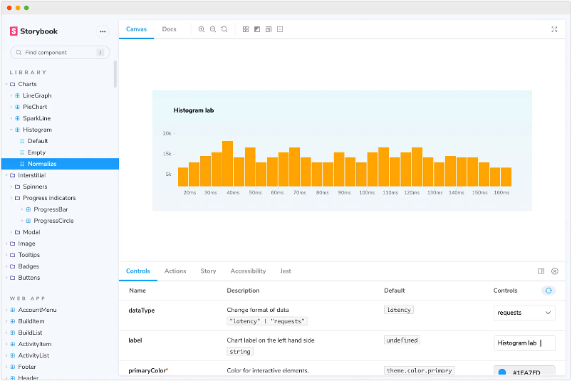
UI components documentation with Storybook
In a nutshell, Storybook is an open source tool used to show and interact with components independently in an isolated development environment. So by using this powerful tool we can focus on one component at a time, developing the entire UI before thinking about all the business logic and complex interfaces.
Working as a kind of playground and documentation, on Storybook we can see a list of all components and also try all their states. This tool also improves code reusability and testing capability.
Main advantages of Storybook:
- Displays all existing components: it prevents developers from accidentally creating redundant components - a common problem in large undocumented projects.
- Serves as a documentation: we can use Storybook to ensure that the style guide (color, fonts, spacings...) is being followed and also show all component states - which improves communication between developers and designers.
- Provides an easy way to perform tests: sometimes a component can render differently depending on its properties. For example, a button can be rendered as full-width or not; as small, medium or large; as orange or blue... So we can easily see and test all these variations on Storybook.
- Helps to improve code quality: since we're going to create components in isolation, we'll tend to focus on their quality and reusability, which is great for the project and the team.
I strongly suggest you take a closer look at Storybook Documentation to read more about this amazing tool.
Testing via Jest and React Testing Library (RTL)
Complex code is not easy to debug and sometimes it takes a long time to find issues. Therefore, testing can guarantee that the application will work as expected.
There are different kinds of tests and ways to implement it. I’m going to focus on Unity Tests here and I also recommend you create tests following the test-driven development (TDD) - this means the test is created before the code itself.
Among the various tools to implement the tests, I like to use the two that appear at the top of this survey called State of JS 2020:
- Jest: it is one of the most popular and satisfying tools because it has several good functionalities already integrated in it, such as: mock, snapshot, code coverage information, and others. It has great integration with the React ecosystem because it is also maintained by the Facebook team.
- React Testing Library: it’s a group of powerful utilities functions for Jest that make our life as developers easier. By using RTL we can select the components by aria-label attribute for example - which can encourage us to write better components through accessibility approaches.
To learn more about Jest and React Testing Library tools I recommend this article: Automating UI tests with Jest and React Testing Library.
Support to PWA using next-pwa
Progressive Web App (PWA) is a collection of modern APIs that enable web application development using progressive enhancement in modern browsers. Taking this approach, the website can be installed and function as a native mobile app as well.
Some benefits of PWA:
- App-like look and feel: add to home screen, offline mode, push notifications...
- No store required: unlike native apps, PWAs don’t require you to go to a place like Google Play or App Store to find and install the application.
- Much cheaper to develop than native apps: companies spend far less to develop, maintain, deploy, and promote PWAs.
No all websites need to be PWA, so you can easily disable this functionality in the boilerplate.
Preventing bad git commit with Husky and Lint-staged
To maintain the good quality of our code, we can use these two dependencies to run some commands every time we commit. By doing this, it will lint the files that will be committed (through Prettier and ESLint) and, if there are errors, we will need to fix the code and try to make a new commit.
You can check the necessary configurations in ./package.json.
- Husk: based on githooks, this dependency allows us to run some events before a commit (pre-commit) and after a commit (post-commit). This project is using it to run lint-staged before any commit.
- Lint-staged: this famous tool will run linters in staged git files based on Prettier and ESLint configuration.
Consistency code generator with Plop
“Plop is a little tool that saves you time and helps your team build new files with consistency.” - Plop tool
So, by using this tool, through some templates, you can run a command to create all the files needed for new components following a pattern, which makes our code consistent and saves us some time.
If you run yarn generate button from command line, a new directory called ‘Button’ will be created under ‘src/components’ containing the necessary files and their basic codes:
- index.tsx
- stories.tsx
- styles.ts
- test.tsx
Check all the configuration for Plop in ./generators.
Conclusion
Creating this modern boilerplate for Next.js made me learn a lot and I tried to ensure that all the important settings and tools I like to use in my projects are here. I hope this starter is useful for you too. Tell me if you liked it, if you intend to use it and if you have any suggestions.
See you next time. 😁