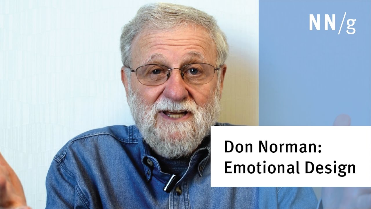


When I started working with web development, I tried to learn a lot about design in order to create beautiful and attractive interfaces. And in the midst of these studies I came across a famous book called Emotional Design: Why We Love (or Hate) Everyday Things by Donald Norman, the person who coined the term “User Experience”. And this book has become the basis of all my projects since that time.
And I only made that book the foundation of my career because of emotions. Because I felt extremely happy to discover something really new for me at that time, because I was happy and completely connected with the book’s idea of making people happy through design.
So, what’s Emotional Design?
“Emotional design strives to create products that elicit appropriate emotions, in order to create a positive experience for the user”. - Don Norman
According to Don Norman, when softwares and systems make people feel good, they tend to work better. On the other hand, when users are not able to use the product, they will feel frustrated and perhaps will give up on using the product.
Another great enthusiast of this subject, Aaron Walter, says in his awesome book Designing for Emotion that “Emotion is a fundamental part of who we are as humans, and it plays a fundamental role in effective design”.
Do you realize how powerful emotions are because they can guide our decisions? Emotions are a very effective tool for influencing someone's response in several ways.
3 levels of Emotional Design by Donald Norman
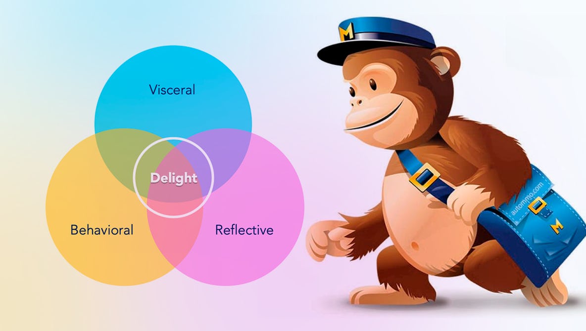
In his book, Donald Norman explores three different, but interconnected, levels of emotional design that designers can apply to build emotions into their products which influences our decisions and experiences in a particular way. The three levels are visceral, behavioral, and reflective.
-
Visceral: it refers to the first impression of a product. We don’t think about it, we just feel it. It’s totally subconscious (automatic) and related to aesthetics and attractiveness: colors, shaps, sounds, sizes...Try to use good images and videos showing people smiling, warm places, fresh water, vibrant colors...
-
Behavioral: although this level is still subconscious, it can be influenced by the conscious mind. It’s about how things work and how we feel using and interacting with them. It’s totally related to usability, functionality and performance based on our previous learning. Some good examples are: menu at the top of the page since this is a pattern we all know, universal icons to express universal ideas (phone icon next to a phone number, for example), feedback to help users understand easily what's going on with the interface in order to avoid frustration…
-
Reflexive: it represents the highest level, the most conscious and cognitive layer. This is when we think about why we like (or dislike) a product, so it's totally related to the user's reflections before, during and after using something: brand image, cultural significance, satisfaction of needs, self-identification with the product… That's why even some products look bad or don't work well, we love them. Because they are sometimes expensive, or sometimes they connect us with people on the other side of the world, or because they deliver our purchases quickly.
As you can see, each level is treated differently and influences emotion (and behavior) in a different way as well. But the best emotional design involves users at all three levels.
How apply Emotional Design in digital products
Based on the three levels of Emotional Design, a good digital product needs to look good to capture the user's attention as soon as they access the page - and that includes consistency, good use of gestalt techniques, good choice of fonts, images and videos. The product also needs to follow interface standards and include feedback messages in order to make its use extremely easy - the usage experience involves not thinking too much about what we are doing. Finally, the product needs to tell a good story and make users feel comfortable with the idea in some way: feeling of pride and identification when using it, for example.
- Give design personality: use a mascot, images and illustrations that users can relate to and empathize with. Ex: MailChimp’s monkey.
- Create a strong and consistent brand: use a unique theme to highlight the design and offer a great first impression of the product. Create a style guide containing the correct colors, icons and fonts for all product visual communication. See some examples of style guides here.
- Use humour and storytelling: using good humor, you can turn a negative experience into a positive one. So, share information in a visual way that establishes understanding and promotes engagement. Also use the narrative to provoke desire in users: show them a part of the project before sign up, include testimonials, success numbers ...
- Pay attention to details, especially in error messages: find ways to avoid user boredom and frustration. Show polite and humorous messages to alleviate any problems.
- Put the user in control of the UI: different users have different personalities, that’s the reason customized applications make success depending on the product. So, empower users by letting them customize the interface. Show personalized content according to their profiles, let them decide what will appear on the dashboard, let them customize their personal information, change colors of the system ... Keeping users in control makes them comfortable.
Conclusion
“I've learned that people will forget what you said, people will forget what you did, but people will never forget how you made them feel.” - Maya Angelou
Experience clearly matters. It’s all about emotions and how users feel interacting with products. And emotions commands attention, affects memory and dominates decision making. They also communicate personality and create meaning. So, emotional design is how emotions can play an important role in design.
As front-end designers, it’s our responsibility to understand users and their needs in order to provide good experiences to them. How to design products that evoke positive emotions and make the user feel good is a huge challenge and I hope you could have a good inicial understanding about this important subject.
Until the next! 👋

